Responsive webpage design is the approach that suggests design and development should respond to the user’s behavior and environment based on screen size, platform, and orientation. It’s about crafting websites to provide an optimal viewing and interaction experience—easy reading and navigation with a minimum of resizing, panning, and scrolling—across a wide range of devices.
In this comprehensive guide, we will explore the various elements of a responsive webpage, from fluid grid layouts to flexible images and media queries. We will delve into some of the tools and techniques that can help you create websites that not only look good but also perform well on any device. We will also discuss the SEO benefits of responsive design, common challenges, and the future of responsive web design.

What is a Responsive Web Page Design
In an era where screens come in all sizes, from smartphones to widescreen monitors, responsive web design has become indispensable. Responsive webpage design ensures that your website functions optimally on any device, by automatically adjusting the layout based on the screen size and orientation. It’s a little bit like liquid in a container, adapting to its environment seamlessly.
Think of the last time you browsed the web on your phone. Did you need to pinch and zoom to read text or interact with website elements? If not, then you’ve experienced the magic of responsive design firsthand.
10 Essential Elements of a Responsive Webpage
So, what makes a webpage design responsive? Here are the core elements:
Fluid Grid Layout
The days of fixed width design are long gone. Fluid grids use relative units like percentages, rather than pixels, for layout sizing. This allows elements on the page to adjust according to screen size.
.container {
    width: 100%;
}

.element {
    width: 50%;
}
In the above example, .container will always take up 100% of the screen width, and .element will always take up 50% of the container’s width.
Flexible Images
Images should also be flexible, able to scale with the layout. They must be sized in relative units to prevent them from breaking the layout when the webpage is viewed on smaller screens.
img {
    max-width: 100%;
    height: auto;
}
The max-width: 100% makes sure the image is never wider than its container. The height: auto; keeps the image’s aspect ratio.
Media Queries
These are the crux of responsive design. Media queries in CSS allow you to apply different styles for different screen sizes, ensuring your site looks great on all devices.
@media screen and (max-width: 600px) {
    body {
        background-color: lightblue;
    }
}
The above code changes the body background color to light blue when the viewport is 600 pixels wide or less.
CSS Breakpoints
CSS breakpoints are critical for responsive design. These are the points at which your website’s content will respond to provide the user with the best possible layout to consume the information. When you define these points in your CSS, you’re creating different layouts for different screen sizes.
@media screen and (min-width: 768px) {
    .column {
        float: left;
        width: 50%;
    }
}
In this example, when the screen width is 768px or more, elements with class column will take up 50% of the width and float next to each other.
Scalable Vector Graphics (SVGs)
SVGs are becoming increasingly important in responsive design. Unlike bitmap images, SVGs are not based on pixels but rather on vectors (points, lines, and shapes). This means they can scale to any size without losing quality, making them an excellent choice for responsive webpages.
<svg width="50" height="50">
    <circle cx="25" cy="25" r="25" fill="blue" />
</svg>
This code will create a blue circle which can be resized without loss of quality.
Touchscreen Consideration
In today’s mobile-dominant world, considering touchscreens in your responsive design is crucial. This could mean implementing larger, more touch-friendly buttons, using menus that are easily navigable with a thumb, or creating forms that are easy to fill out on mobile devices.
@media screen and (max-width: 768px) {
    button {
        padding: 20px;
        font-size: 1.5em;
    }
}
In this example, buttons become larger for screens less than 768px wide, making them easier to tap on a touchscreen.
Typography
Responsive typography is another crucial aspect. Text size should be legible regardless of the device. This might mean scaling up the font size for smaller screens to ensure readability.
@media screen and (max-width: 600px) {
    body {
        font-size: 18px;
    }
}
This code increases the base font size on screens smaller than 600px wide, ensuring the text remains legible.
Conditional Loading
Conditional loading allows you to dictate which parts of your website’s content are loaded depending on the device’s conditions. This could mean deferring the loading of certain content until after primary content has loaded, or not loading some parts at all for smaller devices where they aren’t needed.
if (window.innerWidth > 720) {
    // Load additional content for larger screens
    loadAdditionalContent();
}
In this JavaScript example, the loadAdditionalContent() function would only be called if the viewport width is more than 720 pixels, meaning that additional content would only load on larger screens.
Accessibility
While not often the first thing people think of when it comes to responsive design, accessibility is a vital component. Making sure your website is accessible to everyone, including those with disabilities, is an essential part of creating a truly responsive design.
<button onclick="myFunction()">Click me</button>
In this HTML example, by using the <button> element instead of a styled <div> or <a> element, we ensure that the button is focusable and can be activated using the keyboard, improving accessibility.
Minimalist Design
Minimalist design is key to effective responsive design. By limiting the number of elements on the page, you make it easier to adapt the design to various screen sizes. A clean, clutter-free design is much easier to make responsive. You can achieve it by limiting the number of elements on your webpage and focusing on simplicity in your design. For example, you can prioritize a single call-to-action button, use whitespace effectively, and stick to a simple color scheme.
You should adopt a mobile-first design approach, where you start designing for smaller screens and gradually enhance the design for larger ones. This will ensure the essential elements of your webpage are prioritized, without sacrificing usability on any device.
While designing, keep testing your webpage on various devices to identify any potential issues that need to be fixed. Tools like Google’s Mobile-Friendly Test or Responsive Design Checker can come in handy here.
Remember this is just a starting point, Responsive design often involves a lot more complexities and fine-tuning to get everything looking just right across all devices.
Tools for Building Responsive Webpages
There are numerous tools that can aid you in creating responsive webpages. Let’s delve into a few notable ones:
Bootstrap
Bootstrap is a popular HTML, CSS, and JS framework for building responsive and mobile-first projects. It’s widely adopted due to its extensive library of pre-designed components, CSS customizations, and powerful plugins.
Pros: It’s free, open-source, and has a large community for support. It also provides a great deal of flexibility for customization.
Cons: It can be bloated if you’re only using a few components, leading to slower load times.
Foundation
This is another advanced responsive front-end framework. Foundation provides a similar functionality as Bootstrap but is more flexible and customizable, making it a favorite for many web developers.
Pros: It’s customizable, semantic, and has a flexible grid system.
Cons: Its flexibility makes it more complex, which might be a barrier for beginners.
Don’t forget to do a bit of homework before choosing a framework. It’s like choosing the best companion for your journey – one that aligns with your style and project requirements.
SEO Benefits of Responsive Web Design
Google and other Search Engines loves responsive web design! But why?
- It improves user experience. A visitor is less likely to bounce off your site if it’s easy to navigate and interact with. Lower bounce rates signal to search engines that your site is valuable, potentially improving your ranking.
- A single responsive site means one URL and the same HTML across all devices, making it easier for Google to crawl and index your site. Plus, it’s easier for users to share and link to your content.
- Google actually recommends responsive web design as a best practice, largely due to its effectiveness for SEO.
Online Tools for Testing Responsiveness
The best way to ensure that your webpage looks great on all devices is to test it. Fortunately, there are numerous online tools that can help with this. Let’s explore some of them:
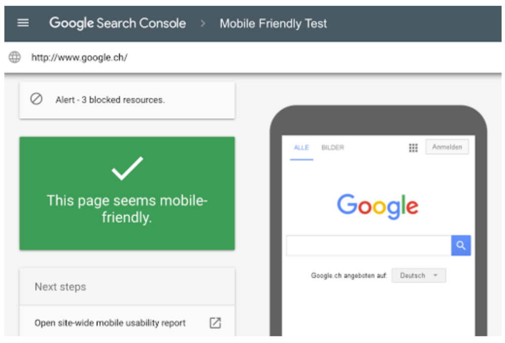
Google’s Mobile-Friendly Test
Google’s Mobile-Friendly Test is an easy-to-use tool that checks whether a webpage is mobile-friendly or not. All you need to do is enter your webpage’s URL, and Google will analyze it for you. Not only does it tell you whether your page is mobile-friendly, but it also offers a screenshot of how the page looks on a mobile device and a list of any page loading issues it encountered.
BrowserStack
BrowserStack allows you to test your website on a wide range of real devices and browsers. Although it’s a paid tool, it offers an extensive platform with various screen resolutions, operating systems, and browser combinations. Its key feature is the ability to interact with your website on the chosen device just as a user would, providing a more realistic test environment.

LambdaTest
Another great tool for responsive testing is LambdaTest. It allows you to perform responsive testing on a cloud-based browser environment spanning over 2000 different browsers and their versions.
Remember, testing is a crucial step in the web development process. By using these tools, you can spot any issues early on and ensure your webpage offers a seamless experience across all devices.
Challenges in Responsive Web Design
Creating a responsive website isn’t without its hurdles. Here are some common challenges that are important to know:
- Performance: Loading times can increase due to additional CSS and JavaScript required for responsiveness.
- Complexity: Creating a website that looks great on all devices can be complicated and time-consuming.
- Content parity: Maintaining the same content across all devices while providing an optimal user experience can be difficult.
However, remember that benefits of having a responsive design greatly outweigh these challenges.
Wrapping Up
Embracing responsive web design isn’t just a trend; it’s a necessity in our multi-screen world. It enhances user experience, boosts SEO, and ultimately, increases engagement on your site.
So, what’s the next step? Start by evaluating your existing site’s responsiveness, and identify areas for improvement. Utilize the tools and techniques discussed here, and don’t shy away from seeking expert help if needed. As you embark on your responsive design journey, remember: the key is to always prioritize your users’ experience.
It’s time to make your webpages as flexible as the screens they’re viewed on. Let’s get started!